Credit: Luc Galoppin
Body
Story update 9/26/2017: The words "distribution of" were inadvertently left out of the last sentence of the second paragraph.
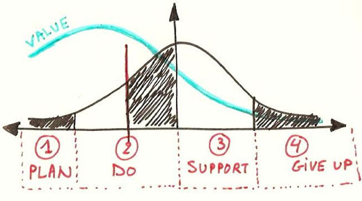
Some practitioners think that if data from a process have a “bell-shaped” histogram, then the system is experiencing only common cause variation (i.e., random variation). This is incorrect and reflects a fundamental misunderstanding about the relationship between distribution shape and the variation in a system. However, even knowledgeable people sometime make this mistake.
|
ADVERTISEMENT |
…
Want to continue?
Log in or create a FREE account.
By logging in you agree to receive communication from Quality Digest.
Privacy Policy.
Comments
Individual Charts
Thanks for the article. I do not agree with the statement: "To determine the correct status of the process, we must look at the control chart of the individual observations, not the subgroup means"
I don't see why it follows that just because the means from a STABLE process follow a normal distribution, why that would lead you to disqualify the use of an averages chart for assessing the process stability. Certainly means from an unstable process do not necessarily follow a bell. And if we are sampling correctly (to capture common cause variation only, the xbar chart should certainly detect the instability.
A fundamental issue with individual charts is that they do NOT detect small process changes quickly. Conversely. charts of averages can detect small process changes by determining the appropriate sample size. Many of my clients need to detect much smaller process changes than can be detected quickly/reliability with an "I chart", so Xbar charts are much more useful. Where sampling is costly, a CUSUM chart on the individuals may be used.
Great point
I used to teach ASQ Black Belt exam prep classes using the Black Belt Primers from QCI. They contained an example that stated that one could determine stability by looking at a histogram. I don't know whether they have corrected that or not.
I think I agree with Steve, but I'd have to know what you meant by "status" of the process. I don't know of any practical utility in running an XmR chart on data for an XBarR chart, unless you have a rule seven violation. If you've subgrouped well, and the XbarR chart shows a stable process, then you have a stable process. If you want to know the shape of the underlying data, then a discrete plot or a histogram will tell you that (but it still won't say anything about stability).
Steve and Rip, The Central
Steve and Rip,
The Central Limit Theorem tells us that the subgroup means will be approximately normally distributed, but just because this distribution is normal does not imply common cause variation of the system. The same is true for individual observations.
Still not sure...
I'm still not sure what you're saying here, John. Does not an in-control R or S chart imply the presence of only common cause variation?
I agree that to look at capability you have to examine the distribution of individuals, not averages, but I believe that is a different question.
Rip, Sorry, I had a typo in
Rip, Sorry, I had a typo in the sentence. "To determine the correct status of the process, we must look at the control chart of the individual observations, not the DISTRIBUTION of subgroup means." That is distribution shape does not imply common cause. Also, your statement about in-control R or S charts is correct.
Typo fixed in text
s-chart and stability
Rip,
A stable s-chart implies that the factors that control the variance are only experiencing common cause varuation. However the system itself could still be unstable if the factors that control location were experiencing special cause variation i.e., the mean was unstable.
An interesting case is the x-chart where all the information about the process is in the chart (i.e., it is a sufficient statistic). Then if the x-chart is stable, does that imply the both the mean and variance are experienceing only common cause variation?
Regards,
John
Correction
Sorry...I replied in the wrong place, and now I see I answered the wrong question. If the x-chart is stable, but the dispersion chart contains signals, that does not imply stabiity of the mean or the variance. The average dispersion is the basis for the limits in both charts; an out-of-coontrol dispersion chart implies that the limits for the averages chart are inflated, and could thus be masking signals in that chart.
Charts indicating stability
Interesting question; I believe that if both charts are free of signals, that does by definition imply a state of statistical control. It's highly likely in that case that the system (at least for that time period) was acted upon only by common cause factors. I have always used those criteria, tests and decisions as my operational definition of "a state of statistical control" or "stability."
Add new comment