Social Sharing block
True confession: Nothing fires quickly from the top of my head—at least anything very lucid or useful.
|
ADVERTISEMENT |
To come up with a good idea, I have to dredge thoughts slowly from the thick sludge and sediment in my brain. It’s not always easy. There are deeply encrusted layers in my cerebral cortex that go all the way back to the Paleozoic era. So coming up with a useful data display—one that uncovers hidden patterns or elucidates interesting relationships—often takes a bit of doing for me. It’s rare that I can nail it on the first shot.
Finding the graph that’s worth a thousand words
After examining mortality data for U.S. males from a period life table, I thought it might be interesting to compare mortality risk between U.S. men and women by age.
First, I entered the data in a Minitab worksheet:
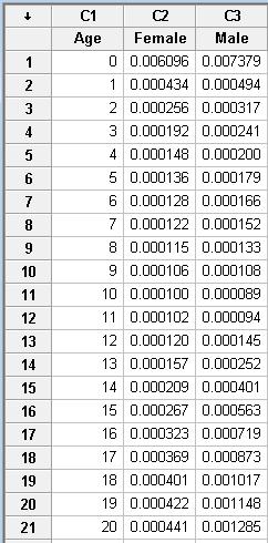
Those raw data are sooo deathly dull, are they not?
…
Comments
First try is never good
Thank you for admitting that you take several tries to get the right display. I find that to be true with my efforts also. I often end up scrapping a whole Minitab session and starting over when I have finally figured out what I am trying to do.
Agreed--for me it's about 99.99% perspiration
At first I was only going to show the last graph I ended up with. Then it struck me that I wasn't really representing the true process of finding the right data display.
Before I can pull a rabbit out of my hat, I often have to pull out quite a few vermin--rats, skunks, Burmese pythons, etc. I'm just thankful I don't have to plot each graph attempt by hand!
Tired of Charting
Quoted from The Kinks' song Tired of Waiting - that is, waiting for a truly meaningful chart. If it can be adequately decoded, the attribute Homo Sapiens should be Homo SAPiens, meaning the use Homo makes of SAP tools, last but not least often useless charting. One thing is charting a ship's route, another one is charting a metal working equipment or tooling for deviation from specifications or tolerance. We have to be very careful: data not always mean truth.
Look Through Any Doorway
Also quoted from a Kinks song... Of course no single chart or analysis tells the whole story. The truth is not behind any one single doorway. But that doesn't mean a doorway doesn't contain valuable info.
Data analysis tools--and any tools for that matter--are only as good as the hand (and mind) that uses them. So you're right--they don't always mean literal truth. But neither does purely subjective experience. The objective and the subjective inform and balance each other.
Add new comment